The Cute, The Quirky and the Ugly: The Signs of Ambergris Caye and Caye Caulker
I am a giant GIANT fan of hand-painted, colorful signs for businesses, private houses…for just about anything. Neon? Flashing lights? Gaudy pre-printed signs? Not a fan.
So as I look through thousands and thousands of my pictures from the past few years, I thought I’d post just a handful. I’ll let you categorize them as cute or bizarre. Who I am to pass judgement? Here are my faves…let me know if I missed any of yours.
And just to be clear what type of sign I DON’T like…here is an example.
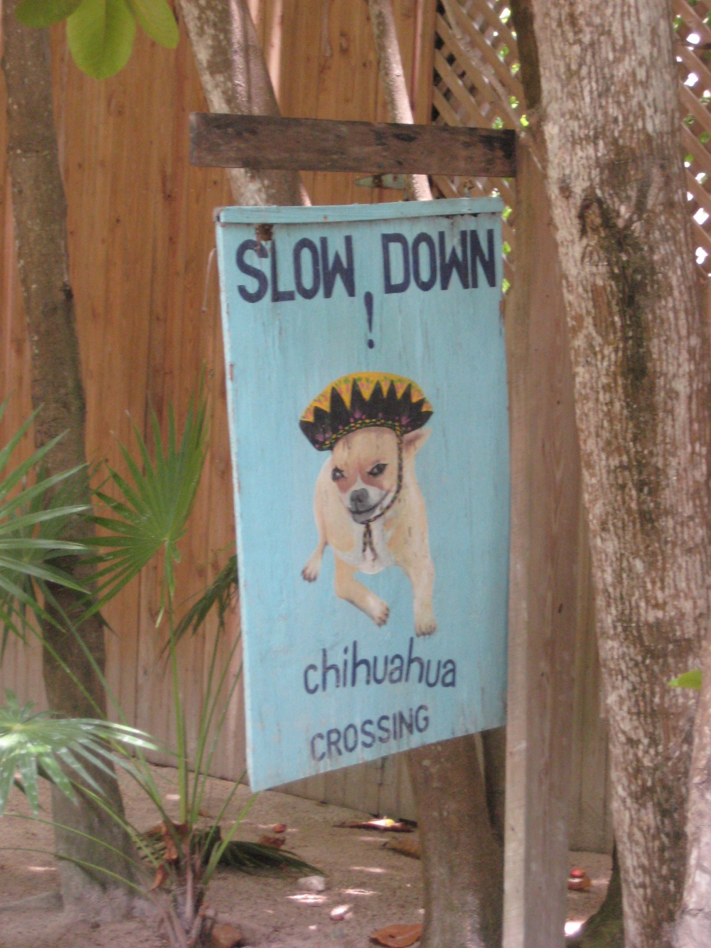
Let’s start in Caye Caulker, an island which just oozes cuteness.
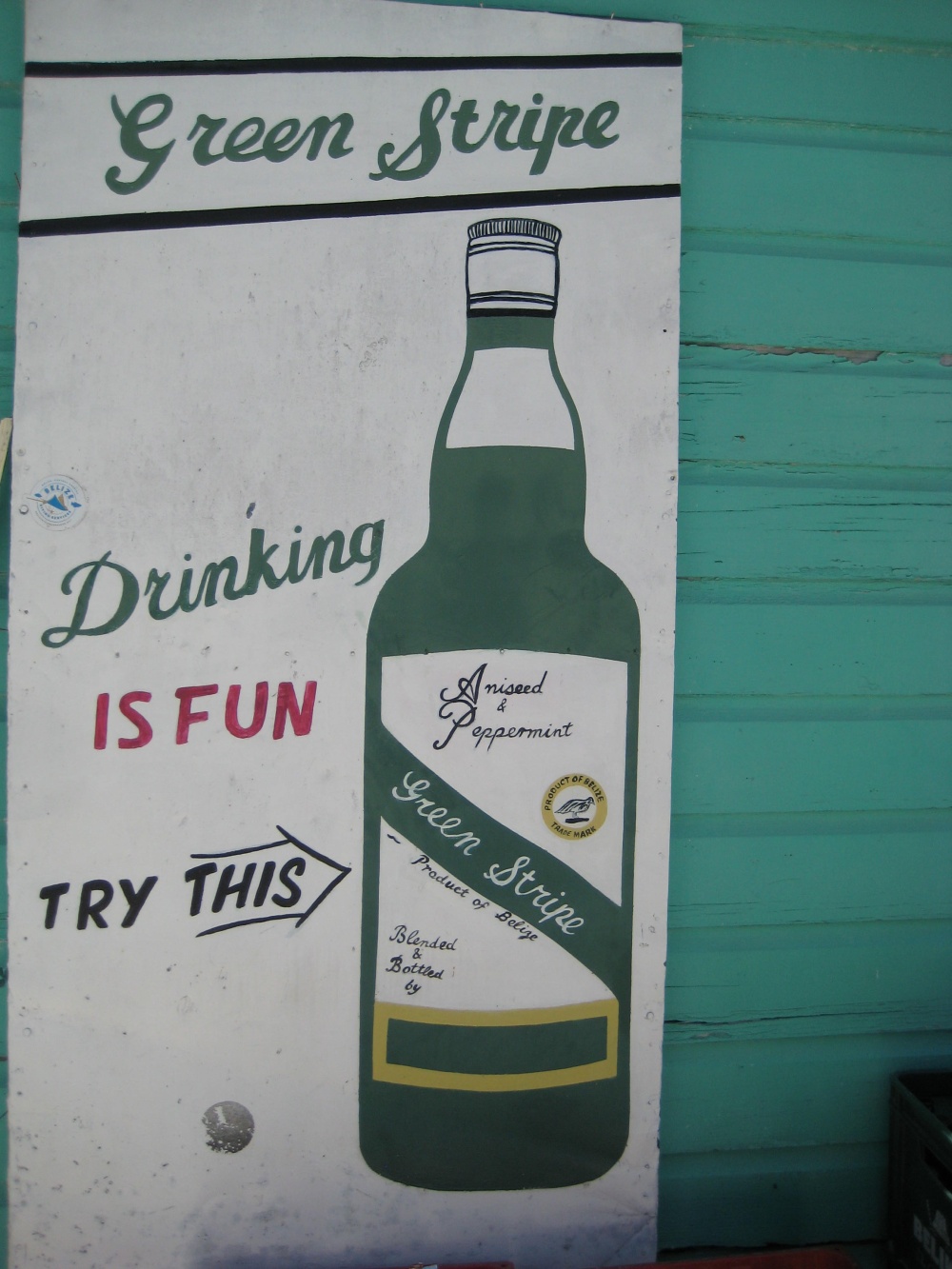
Drinking is fun. Simple, appeals to all ages and straight to the point. Though take my word for it, drinking green stripe is NOT fun.
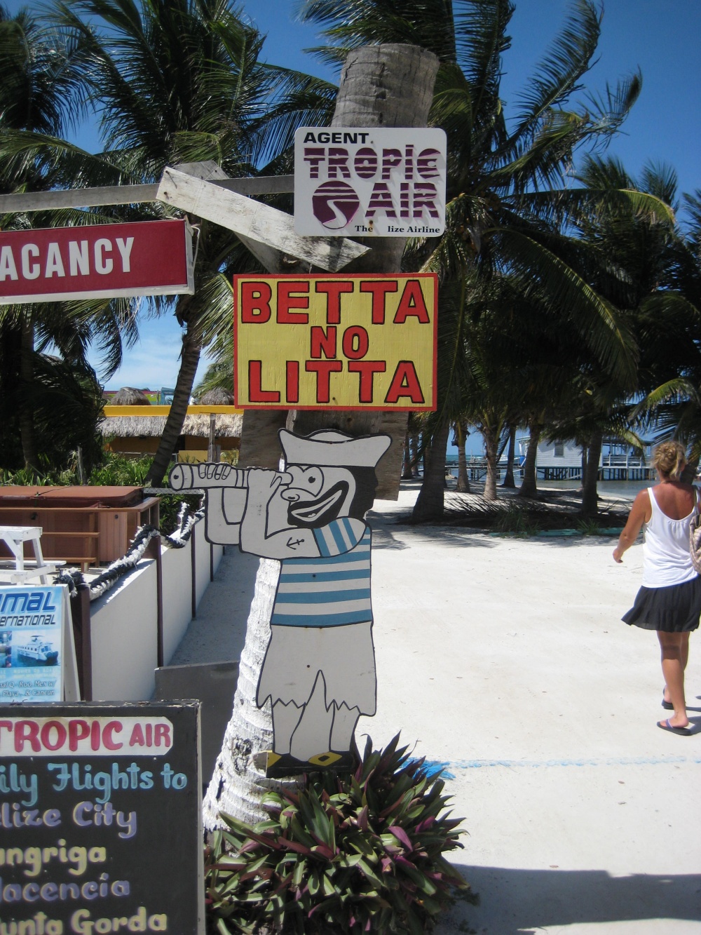
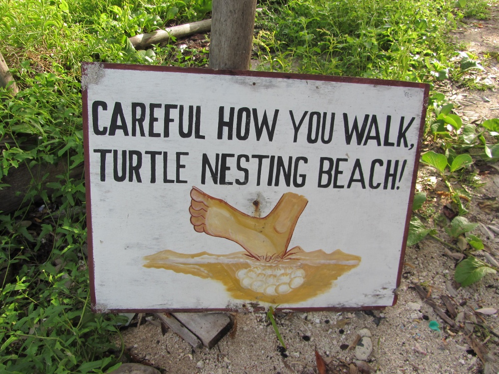
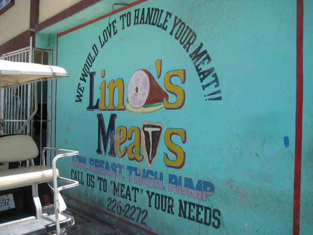
 Also straight to the point.
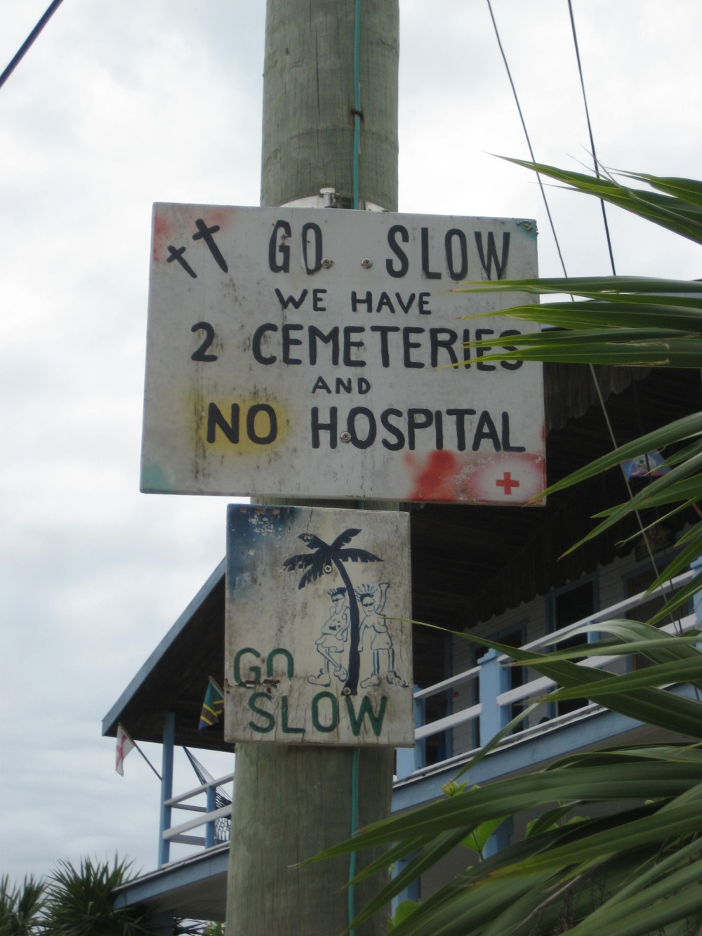
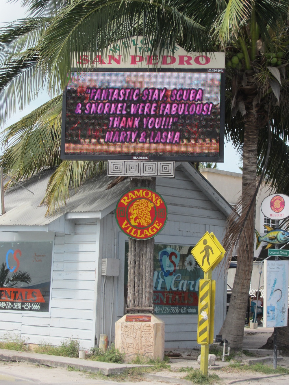
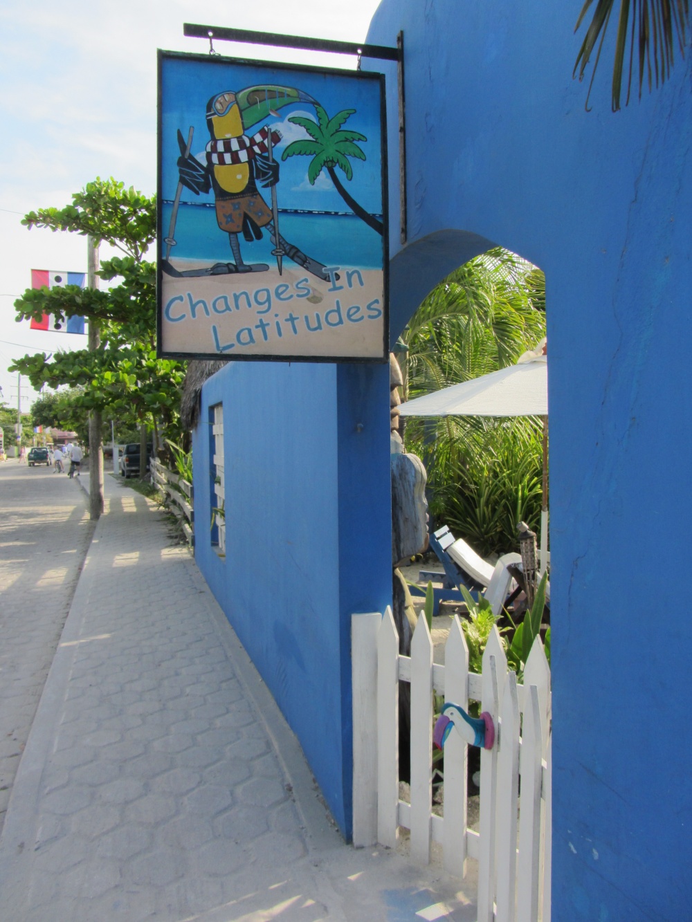
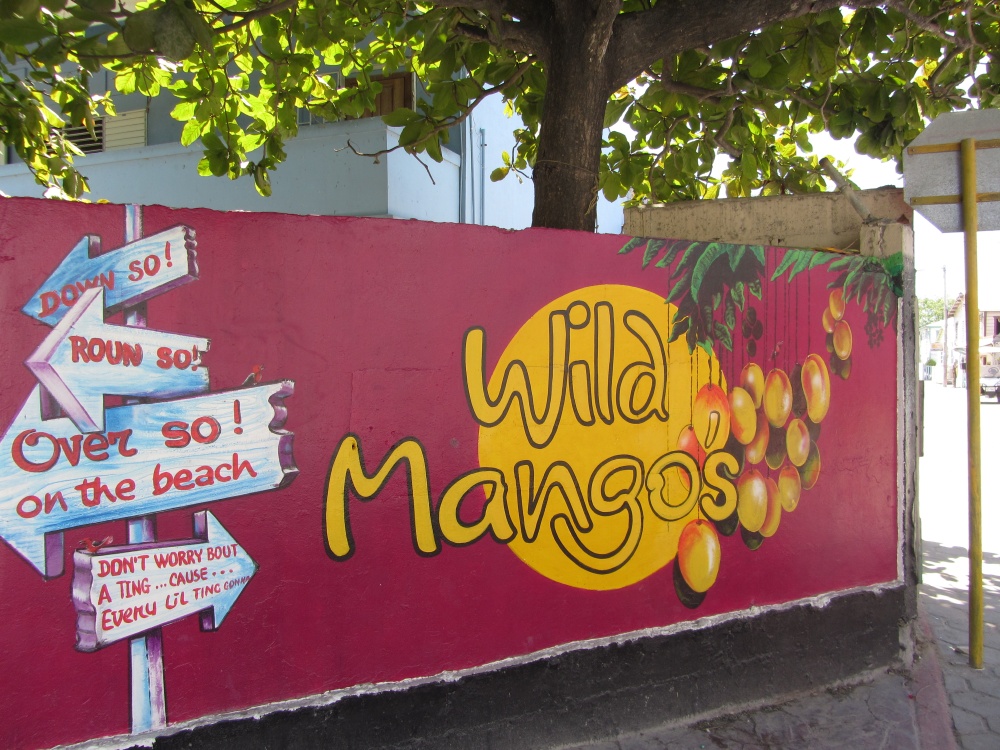
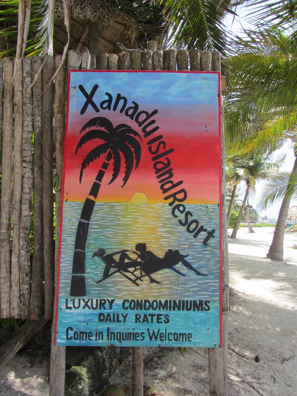
Let’s move across the way a bit to San Pedro. In the Tres Cocos area.
One of the cutest logos…
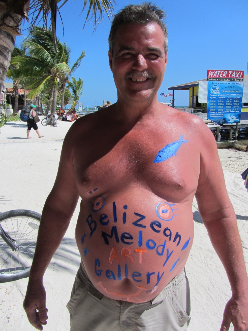
And certainly one of the most original for Belizean Melody’s Art Gallery.
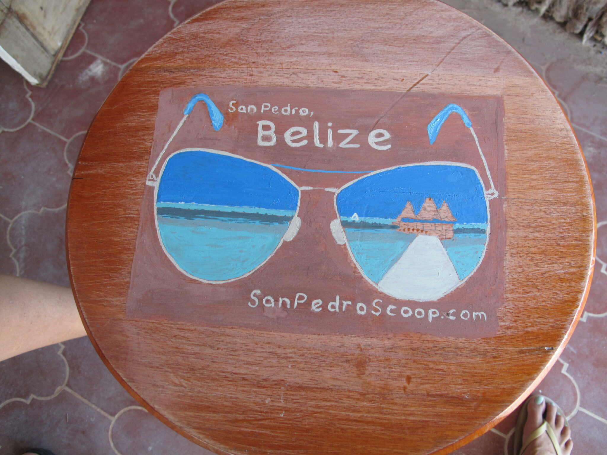
Now the coolest bar stool around…
And perhaps the very best in town.
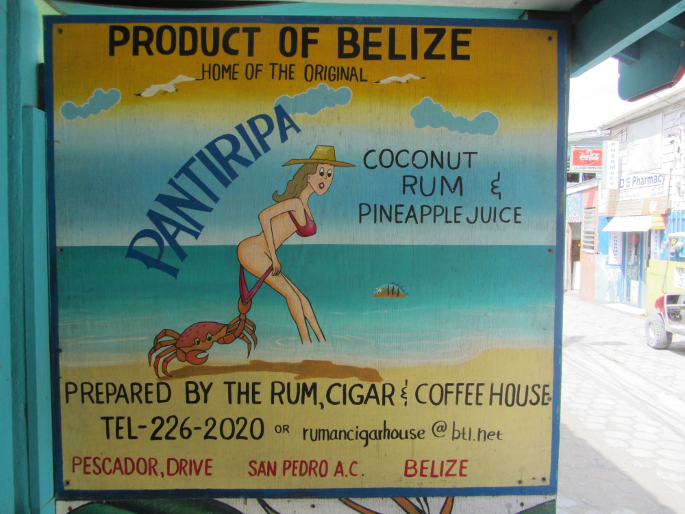
It also translates to the cutest t-shirt in town. Saul, the owner of The Rum, Cigar & Coffee House assures me a new shipment will be in in 2 weeks. THE best souvenir.
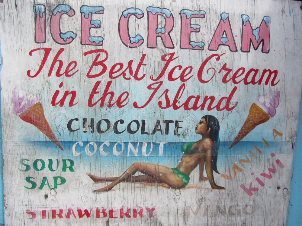
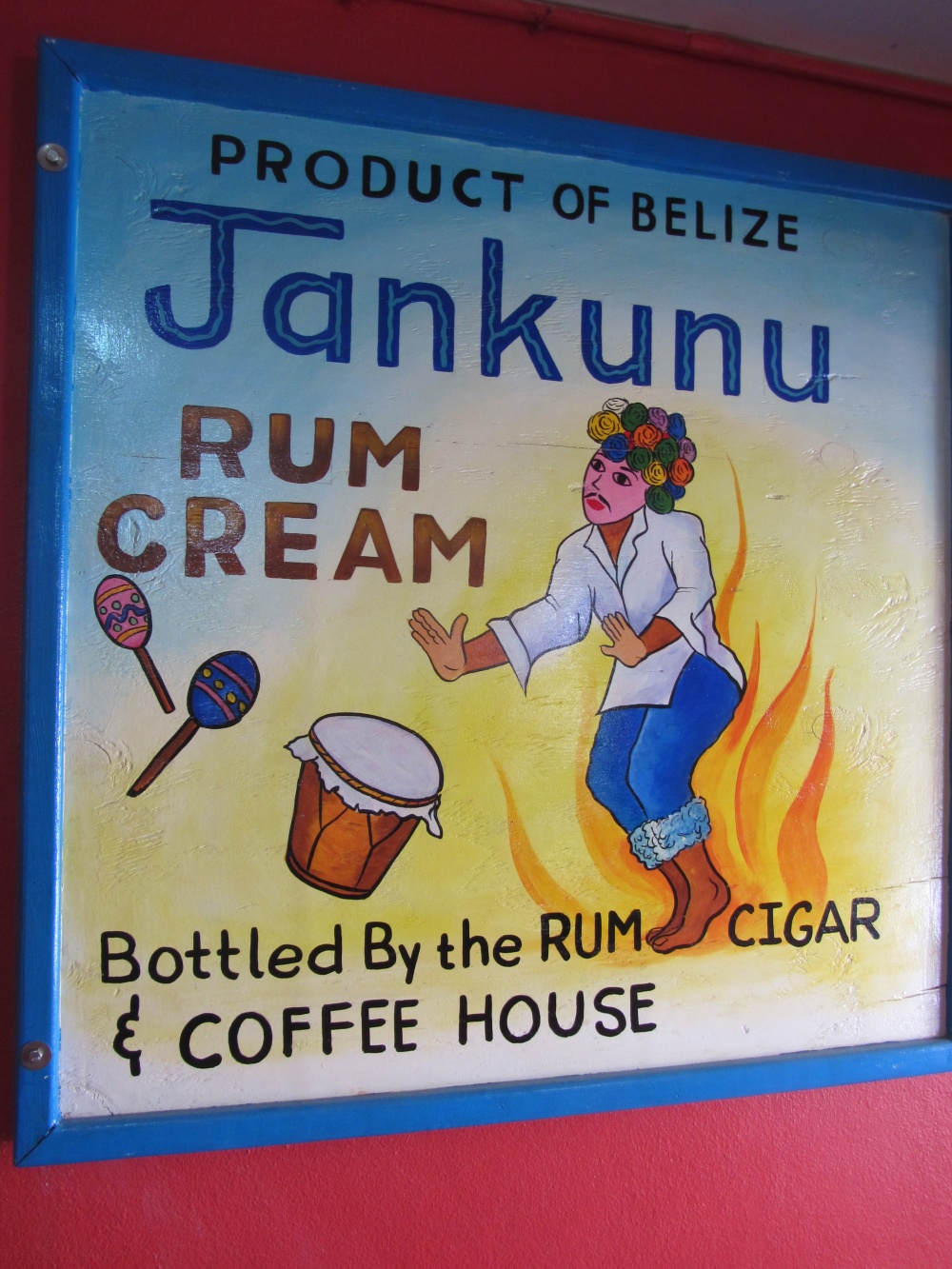
They’ve got cute signs all over the shop.
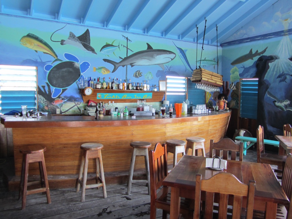
I love painting on the walls of bars and restaurants…like the Tackle Box at Tranquility Bay…
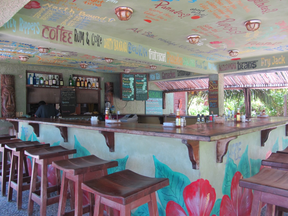
or when you are eating at Ak’Bol Yoga Retreat.
And a few more…
And from Estel’s by the Sea. Very simple and cute.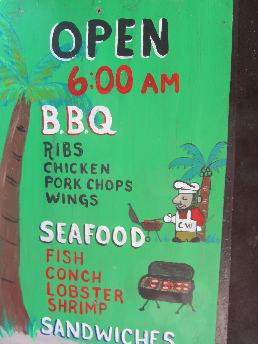
There are so many more! I am going to have to do a Part Two next week. But I think you can pick up what I am laying down. Catch my drift. I think you can dig it.
LIKE. (Oh very very much I like.)
Just not the same (the sign that replaced it)…

And DISLIKE.
Just my opinion.
Posted in: